Blossom by the lake
Ben and I have been in our home for over 3 years now and you’d think we’d pretty much have it all decorated with pictures and art on the walls, but no. The result of having two designers under one roof is both have big plans for your dream home and we’re still working towards making those ideas a reality. But there comes a point when you just get fed up of looking at blank walls. The lounge is the first room you enter when visiting our house and since we’ve been here our only accomplishment is to paint a feature wall in a kings red. With such a striking colour I wanted a painting on there that wouldn’t clash or be too overpowering. In just over a day I created this serene landscape with subtle tones of pink and red, complementing the intense colour of the feature wall.
Painting the background
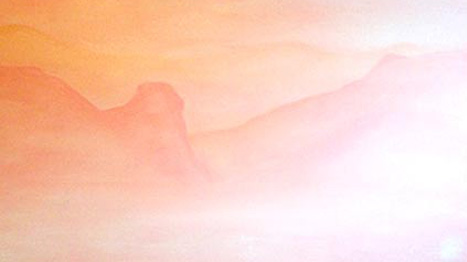
The mountainous valley was composed of a layer of colour washes starting with the lightest warm pink across the canvas. Adding slightly more paint to the mix and less water I began to build up the mountain shapes, increasing the paint consistency as the distance of the mountains decreased. The water’s edge and trees followed with a much darker salmon pink, which helped to introduce some depth to the scene. The lake still had the initial wash at its base, so for the tranquil, undisturbed effect I envisioned, I introduced some of the darker washes with straight horizontal lines to act as shadows and reflections.
The cherry blossom
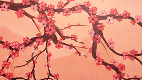
With the background complete the next stage was to begin the foreground. The scary part in which you paint across the work you’ve already taken time to get just right. I always get nervous at this point because any misplaced stroke of the dark colour can ruin the light washes and make it near impossible to rectify. I had to remind myself to remain confident and make any slip or unintentional brush stroke work in my favour. In reality no two branches are the same, so at times when I loaded the brush a little too much and created thicker marks than intended, I realised I actually made the branches appear that much more realistic.
My next task was to introduce red and pink five-leaf blossoms. To do this I painted five small strokes in the shape of a starfish. Any forward-facing blooms were then given black dotted centres and highlights. Whilst there is no ‘magic number’ of blossoms that needed to be added to the scene, I kept taking a step back to view the canvas in full and I stopped when I thought the background was in danger of becoming too obscured. I always find that when I look at my work that there are more things that I could do or things that could be changed. I get to a point where I need a second opinion and having Ben in the next room to run things by is always an advantage, knowing that he’ll be honest and give constructive criticism and feedback is always a plus.
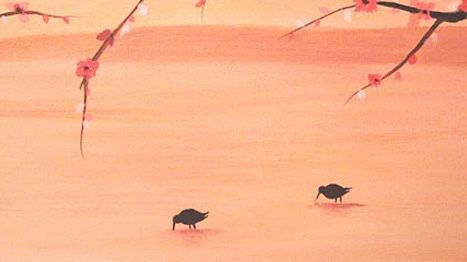
I still felt something was missing and a focus was needed within the shallow waters of the foreground, so the feeding Dowitcher birds were the finishing touch.
Development stages
Below are some images of the painting in development. This is something I always forget to photograph as I’ve zoned out and gotten carried away with painting. But it is something that I want to be able to show you as it helps understand the journey and techniques used.
This is the first piece I’ve painted that isn’t highly focused on detail but rather blocked colour and silhouettes. I really like the simplicity in the techniques I used and how it is a complete contrast to the red forestscape I painted last year. I haven’t ventured into mountain based landscapes before, but it is something I’d like to challenge myself with in the near future – there is a blank wall in my bedroom with it’s name on it!